
18 Aug Three Packaging artists
Index of contents:
- Andy Warhol for Campbell’s: the soup that made it into museums
- Carlos Vives i Torrella for Ideales & Smoking: the genius of Spanish graphic design
- Raymond Loewy for Lucky Strike: less is more
- Designing packaging to make history
There are packages you never forget. Some are born from the most groundbreaking art, others from the precise lines of designers who changed the way we see products. In this article, we look back at three key names who, from different worlds, elevated packaging to the category of art and visual culture: Andy Warhol, Carlos Vives i Torrella and Raymond Loewy.
Andy Warhol for Campbell’s: the soup that made it into museums
Andy Warhol transformed the perception of contemporary art and commercial graphic design. His use of repeated images, flat colors and industrial aesthetics not only immortalized Campbell’s soup, but inspired generations of designers to see packaging as an extension of popular culture. Warhol recognized that the everyday – a supermarket can – could have as much visual and emotional value as a piece of art in a gallery.
In addition to his famous series of Campbell’s soup cans, Warhol also immortalized Coca-Cola bottles, Brillo detergent wrappers and perfume labels such as Chanel No. 5, elevating packaging to the language of pop art. Each package was an excuse to talk about consumption, fame, repetition and desire.
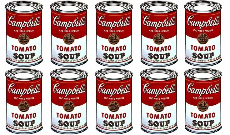
Campbell’s Tomato Soup, an iconic design reinterpreted by Andy Warhol. Pop art applied to everyday life. Via Amazon.
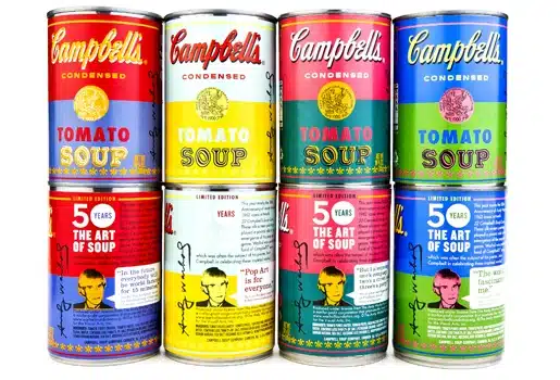
In 1962, Warhol painted 32 Campbell’s soup cans. He didn’t modify their design: he reproduced it, repeated it and turned it into art. Without even trying, Campbell’s became a pop art icon. What was meant for supermarket shelves ended up on the walls of museums, challenging the idea of what deserves to be considered art.
Decades later, in 2012, Campbell’s reissued its cans with Warhol’s design as a special edition. The gesture not only celebrated the artist but confirmed the impact of his work: the image of an everyday product could become a cultural symbol.
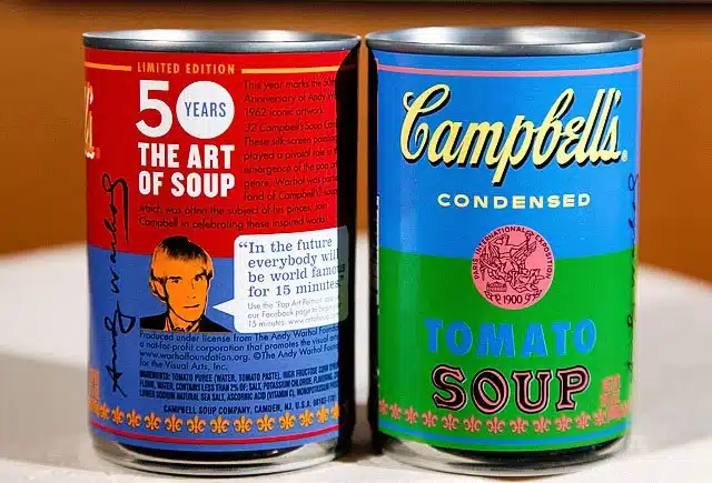
Today, the Campbell’s soup can is remembered not only as food, but as one of the most powerful examples of how art can amplify a brand. The packaging didn’t change. Its meaning has.
Carlos Vives i Torrella for Ideales & Smoking: the genius of Spanish graphic design
In the Barcelona of the 1930s, Carlos Vives signed his name to some of the most emblematic designs of Spanish packaging. During the Second Republic, when the concept of “packaging” as such did not yet exist, he worked in Rieusset’s graphic workshops, where he created original packaging for all kinds of products: cigarette packs such as Ideales, Bison or Americanos, cigarette papers such as Smoking, and even promotional cut-outs such as Caldo Maggi.
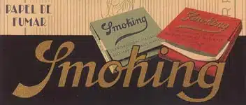
Classic advertising for Smoking, designed by Carlos Vives. Elegant and lasting visual identity, symbol of the commercial graphics of the 1930s. Via Estilográfica.
With an aesthetic marked by Art Deco, bold typography and an elegant approach, Vives transformed these everyday objects into pieces of visual communication. His designs didn’t just dress the product – they also conveyed identity, desire, and modernity. The Ideales cigarette pack, for example, is now an icon of visual volume, graphic rhythm, and period style.
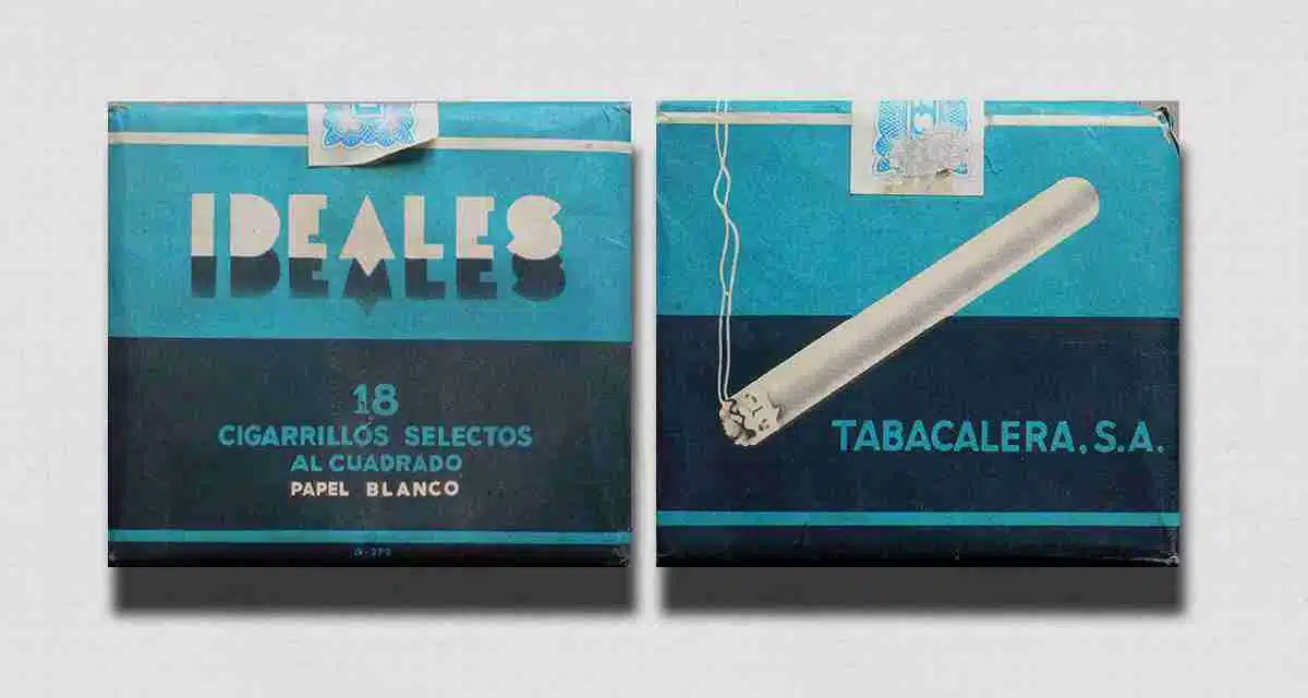
Design of the Ideales cigarette pack. Art deco typography, visual volume and an aesthetic that marked an era. Created by Carlos Vives in the Rieusset workshops during the Second Republic. Via BrandStocker.
But Carlos Vives did not work alone. At Rieusset he shared space with an exceptional team of graphic artists, sign makers and illustrators. Among them was Tomás Vellvé, renowned for his mastery of technical and decorative drawing. Many others, often anonymous, explored advanced printing techniques to achieve stunning finishes. More than a printing house, Rieusset was a true creative laboratory where art and industrial production came together naturally.
Through his work, Vives turned product design into an effective visual language, capable of conveying values, style, and brand character. His designs have not lost their impact over time – they still work, they still communicate. They prove that when design is good, it transcends its era.
Raymond Loewy for Lucky Strike: less is more
Raymond Loewy redesigned the Lucky Strike pack in the 1940s with an innovative vision: he eliminated the green background, centered the iconic red logo and opted for a clean, symmetrical composition. He transformed a cluttered design into a clear, recognizable and visually powerful piece. The impact was immediate: sales increased, and the brand gained a graphic identity that is still associated with elegance and clarity. He was one of the first to apply the principles of industrial design to mass consumer packaging and understood that minimalism could be a powerful tool for differentiation. His approach was so effective that it remained virtually unchanged for more than six decades. Because when a design works, it needs no tweaking: just time to become a legend.
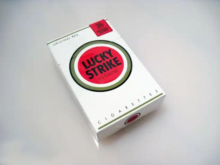
This project was not an exception, but a shining example of Loewy’s approach. Considered one of the fathers of modern industrial design, his motto – “ugly doesn’t sell” – guided his entire career, from trains and appliances to bottles, packaging and vending machines. His legacy in packaging goes far beyond tobacco: he designed bottles for Coca-Cola, vending machines for Pepsi and packaging for brands such as Nabisco and Shell. His integral vision of the product, from its shape to its presentation, forever changed the way brands understood their presence at the point of sale.
Designing packaging to make history
Warhol through art, Vives through editorial illustration, and Loewy through industrial design. Three different paths, one shared truth: a good package can tell a story, evoke emotion, and transcend the product it contains.
At Rieusset, we believe that design is not decoration, but a statement of principles and business strategy. That’s why we treat every label as an opportunity to make a lasting impression. Because maybe, years from now, someone will hang one of our labels in a gallery – or at the very least, in their memory.
| We Manufacture: | Meet Rieusset: |