28 Feb Labels, packaging and marketing, a winning combination
Triangles are geometric figures that symbolize perfection. For some cultures they represent the three kingdoms: animal, mineral and vegetable. For others they symbolize strength, beauty and knowledge. But all of these cultures believe that they are elements and qualities that live together in unity. They all balance, complement and nourish each other – to the point where one part cannot exist without the others.
Packaging, labeling and branding, a perfect love triangle
This is the metaphor we have wanted to use in this post to talk about another “love triangle”. And it is none other than the one of labels, packaging and marketing. Or how the first two need the last one in order to be able to persist over time.
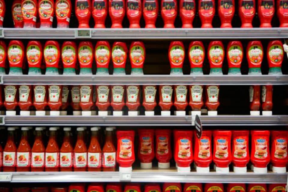
In Rieusset we are aware that these three elements of a given product are indissolubly linked. When designing a packaging, if later on there is no communication to back it up, the product will most likely fall into oblivion. It will just gather dust on the shelves and will end up expiring or being withdrawn. Or imagine that the packaging is attractive but upon opening it the label is illegible, it looks old-fashioned or it is produced with low quality materials. It must be kept in mind that the printing and the materials used for production also count, and a lot. Therefore, the initial effort of making an impact with good packaging will all have been for nothing.
When a customer looks at a product, they are mainly looking for two things: price and quality. If we want a product to stand out among a sea of similar options, it is absolutely necessary to make sure that it has the required quality. And what do we do to reflect this quality? By creating quality packaging and labels and communicating in a creative and clear way that the product really lives up to it.
Take the example of the milk brand Molocow. With the design of their packaging and labels they created something different from everything else on the supermarket shelves. They speak for themselves and communicate their entire world. This is visual marketing at first glance. Without a doubt, when seeing it the consumer is filled with curiosity and wants to try it. Would you be abducted by this milk?
Just imagine if we go to the shelf and the bottle that has just captured our attention has a label that is peeling off, is otherwise broken or has blurred ink. What would you do? Automatically the product will be judged by this and surely won’t end up in your shopping cart.
To show that our product is of high quality and meets the requirements, you have to say it loudly and clearly. This is where marketing teams up with packaging and labeling to make our product stand out, to assure that the consumer immediately feels its excellence and properties. The point is to communicate the value of what we are trying to sell to the consumer as quickly as possible.
Achieving balance, although not an easy task, is possible. And once you have achieved it, the product will surely have a prosperous future. After obtaining this quality for your product, you have to design an attractive label and the packaging to put it in. Subsequently, it has to be produced with state of the art machines, using the right materials. Distinction lies in the details.
Packaging and labels as part of the marketing strategy
But what are packaging and labels really good for? Why are they so necessary? Very simply: because both form part of a global marketing strategy. They are part of the 5 P’s of marketing: product, promotion, price, place (distribution) and packaging (and labeling). They both contribute value and return to the brand and give sense to the previously established marketing strategy. It is necessary to take care of every detail in order to stand out with it and increase the return on investment. However, not only do you have to highlight the package that keeps and protects the product, but also the label.
Let’s take an example. You go into a supermarket in the middle of summer to buy a bottle of water. Among all those you see, would you take special notice of this one? Due to its transparencies and bubbles, this label transmits a feeling of coolness, cleanliness, purity, transparency. Its design won the third prize in The Dieline Awards of 2010.
Another example is this label designed for a craft beer, Lone Bee, and which received the first prize in the drinks category. This type of zigzag symbolizes the path of a solitary bee in search of nectar for its colony. The design shows the bee’s journey visually, the perils to which it is subjected and which it encounters while making its way alone. It is also a metaphor for how the creators of this beer had to overcome several obstacles before coming upon the prefect beverage.
Without a doubt, a good label is an action that has to be in line with the marketing strategy. In order to obtain the best result, another crucial factor is choosing the best supplier. We at Rieusset know this, wherefore, if you put your trust in us, we will not only help you get it, but we will do this by contributing solutions.
| We Manufacture: | Meet Rieusset: |


