
26 Sep How the color of packaging influences the decision to buy
A product’s packaging is one of the strategic sales tools that sets an article apart from its competitors at the point of sale. It influences the consumer’s decision to purchase, and it is one of the reasons to choose a product or pass it by. It is, as we said in another Rieusset article, the “love at first sight” between the brand and the consumer.
A product’s shape, its call to action or the material it has been designed with are important aspects that can convince the user to buy it. But there is another fundamental factor that should not go unnoticed, and that’s color.

As we are going see in today’s post, color also plays an important role when trying to convince consumers and get them to take a product home. According to a study, around 85% of buyers make quick decisions about the products they wish to buy depending on color. This greatly influences us, our moods, our feelings and how we perceive things. This association is made, as we will see further on, subconsciously. It is our subconscious, drawing upon one value or another, that debates the purchase of a final product depending on the color with which it has been designed. An eye-catching package with bright colors has more possibilities of being chosen than another one with inadequate or dull colors. It also tells us to which category it belongs. Let’s see some examples:
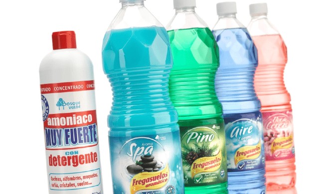
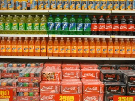
- Red or orange colors indicate energy, vitality, joy, passion. You are most likely thinking of soft drinks or perfumes now.
- Bluer tones express tranquility and security. They are used most often in companies that have to generate confidence and trust, as is the case with banks or insurance companies.
- Green denotes balance, ecology, health, often used in healthy foods.
- Black means power, elegance, wealth. Don’t premium beverages or gourmet foods come to mind?
- White, on the other hand, is associated with products that wish to radiate peace, pureness, honesty, style. It is used a lot in cosmetics and beauty or dairy products.
Colors speak volumes, wherefore choosing them well and with careful consideration is crucial, because the colors that are used to design a product must project the correct message to our target audience. In this sense, companies are increasingly investing more effort and resources in trying to influence their customers’ behavior through the colors of their packaging.
But why does our subconscious pay so much attention to color tones? The answer is logical and inherent to human beings. According to a study, between 80% and 90% of the information that our brains receive and process comes from our sense of sight. This is due to the fact that our eyes contain 70% of the information receptor sensors. And there’s even more. Experts claim that our brain takes only 2.5 seconds to decide on a purchase. If, for example, our product attracts attention immediately due to its intense color, it will have more possibilities of being chosen over a competitor’s product.
Colors comply with several fundamental functions
Now we can better understand why color is one of the main elements in packaging, and, as already commented, that it has a direct influence on the user’s perception of the product and his/her decision to take it home. This, in turn, is related to the impact on sales. The colors for packaging are not used arbitrarily; in a well thought out and designed packaging they comply with several fundamental functions:
- Attracting the user’s attention
- Building the product’s identity
- Establishing the brand’s personality
- Differentiating it from the competition
- Supplying information about what it holds inside
- Adding emotional information
- Creating a bond with the user
Curiously, however, users don’t stop to think consciously about the color combination of a product and the message it transmits to them. But its effectiveness is in no way reduced by this. The values nonetheless penetrate involuntarily into our brains, thus giving rise to the “magic” of colors.
If you are thinking of launching or redesigning a product, don’t forget that colors establish an unwritten connection between the brand and the user. Therefore, choose them well, since they will affect how customers or potential customers see your product or brand from hereon.
| We Manufacture: | Meet Rieusset: |