
14 Dec Do image and lettering influence how packaging is perceived?
Although it may seem self-evident that the image of a product and the lettering or typeface used on the label influence the consumer’s perception, the reasons for why this happens are not all that obvious. In the case of a product such as wine, more than 80% of consumers who know nothing about wines base their choice on image rather than price or the wine’s origin – in other words, on the perception transmitted to them by the label and the container. This particular sector is rather traditional and resistant to innovation with regard to labeling. However, there are already some companies, such as Freixenet or Ogeu, that have experimented with sleeve labeling, whereby they are able to capture the perception of indecisive consumers much better.
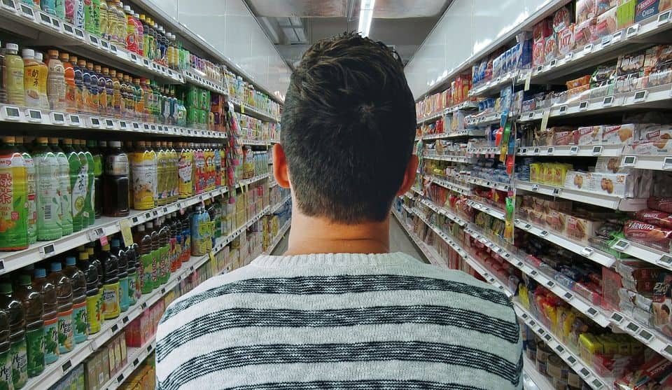
The consumer’s perception of a product is usually based on its image, an image which is configured through the impact received by the product in question. Thus the consumer’s perception of a product is essentially made up of: the price, the product’s container and the advertising for that product.
However, in the case of consumers who don’t know a specific product and have never seen the advertising for it, it is highly likely that they will select it because of its container. If by looking at it they experience a good perception of the product, unless they are price-concerned consumers and the product in question is highly priced, they will select it based on its image. In summary, yes, image and font do influence a container’s perception, and to such a degree that it can mean the difference between success and failure of a product.
We have made it clear that the image of a product influences the consumer’s decision to buy. That’s why packaging is such an important element in marketing. And not only because of its persuasive function but also because it protects the contents and through the label supplies information to the consumer.
Factors that influence the perception of a package
Colors
Normally, each product category has certain colors associated to it. There is a kind of relationship between particular colors and products. While shades of white, green and blue are usually recommended for cleaning products, for beers it is gold, red and brown. Right now, surely images of products from these two categories are coming to your mind which coincide with these colors. According to several studies, up to 90% of the quick judgements made about these products by consumers at the point of sale can be based on color.
Image
The use of images when designing packaging and labels can attract more clients. The majority of consumers seem to prefer to build their perception of a product based on the images instead of the text. There is a biological explanation for this, since we process images up to 60,000 times more quickly than text. We have greater capacity to retain visual content than any other format of information. We remember up to 80% of what we see, as opposed to only 20% of what we read, or a mere 10% of what we hear.
Therefore, the image is an essential element when designing packaging and labels. This image, however, must be in line with the personality of the brand in order to achieve an adequate positioning in the consumer’s mind.
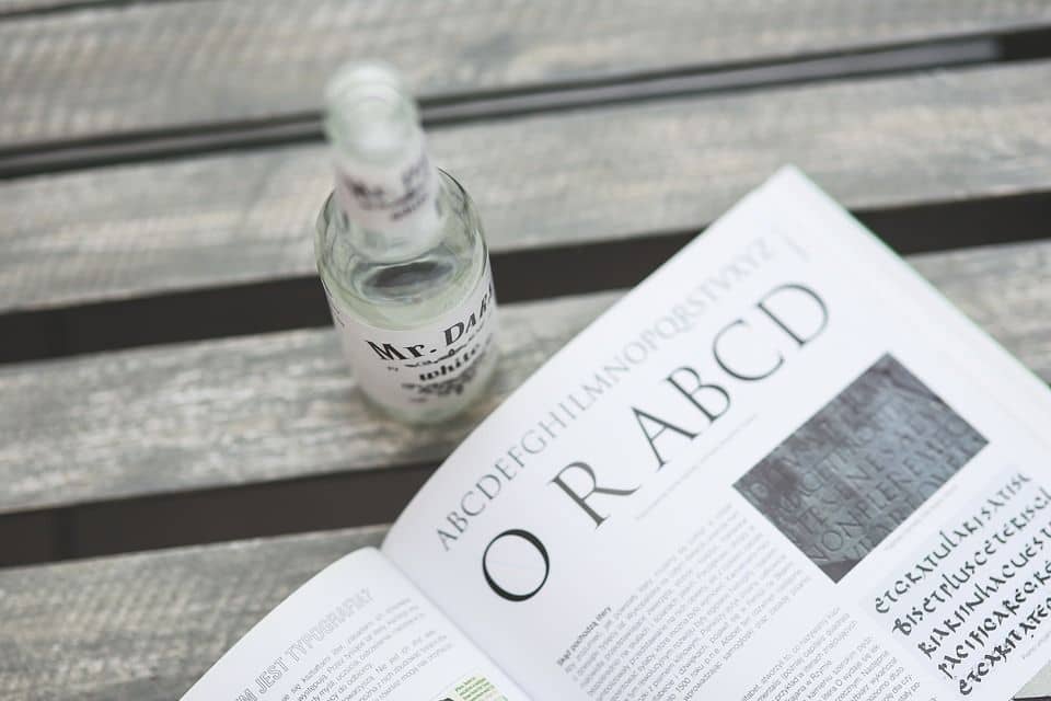
Lettering
A good packaging design should represent the qualities of the brand not only through the lettering that is selected, but it must also carefully choose the words that give the consumer as much information as possible relevant to the product in question. The idea is to make the consumer able to position the product at a glance so as to facilitate the decision to buy.
The lettering is one of the key elements that can make the design attractive to consumers. The golden rule is legibility. It does not matter how modern a font may be – if you can’t read it, it will be impossible to induce buying, since the message that is supposed to be transmitted gets lost. A good example is this back label of one of our clients: Estrella Damm.
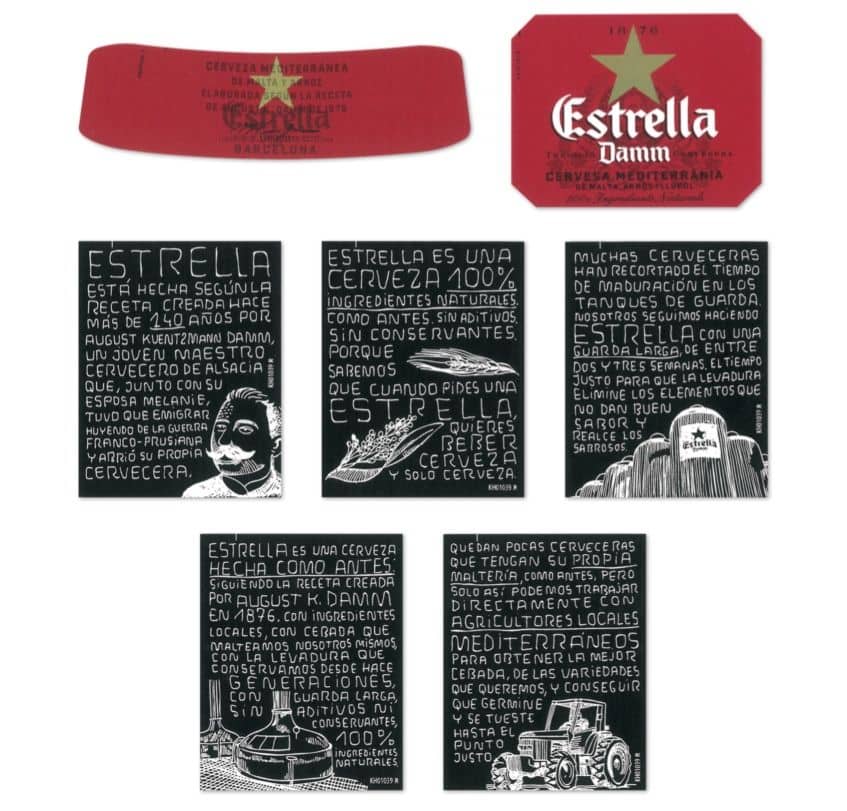
In this design, a perfectly legible handwritten lettering was used, with the purpose of simulating chalk writing on a blackboard, and thus transmitting the product’s outstanding quality: a traditional recipe made with natural ingredients. A quality that is very much appreciated by consumers and which in this case has been communicated in a very subtle and efficient way.
As you can see, the image and the lettering used on a label can mean an increase in sales of your product. In Rieusset we put our team of professionals at your disposal to advise you on the best labeling solutions for your products. Let’s talk.
| We Manufacture: | Meet Rieusset: |